Increasing site speed by 20% using Shopify's image compression (free code snippet)
Optimizing Shopify Images in 2026: Latest from image_tag
Update (March 2026): If you've been using custom image compression snippets, there's good news. Shopify's built-in image_tag filter now handles everything your custom snippet did—and does it better.
This guide shows you how to modernize your image optimization using Shopify's native tools.
Why Update Your Image Optimization?
Large images still kill site speed. Sites loading > 3s lose 53% of mobile users (Google).
But the solution has evolved. Custom snippets were necessary in 2022. In 2026, Shopify's native image_tag handles:
- ✅ Automatic responsive sizing (srcset)
- ✅ Modern format conversion (WebP with fallbacks)
- ✅ Lazy loading built-in
- ✅ Preload integration
- ✅ Better performance optimization
Translation: Less code, better results, native support.
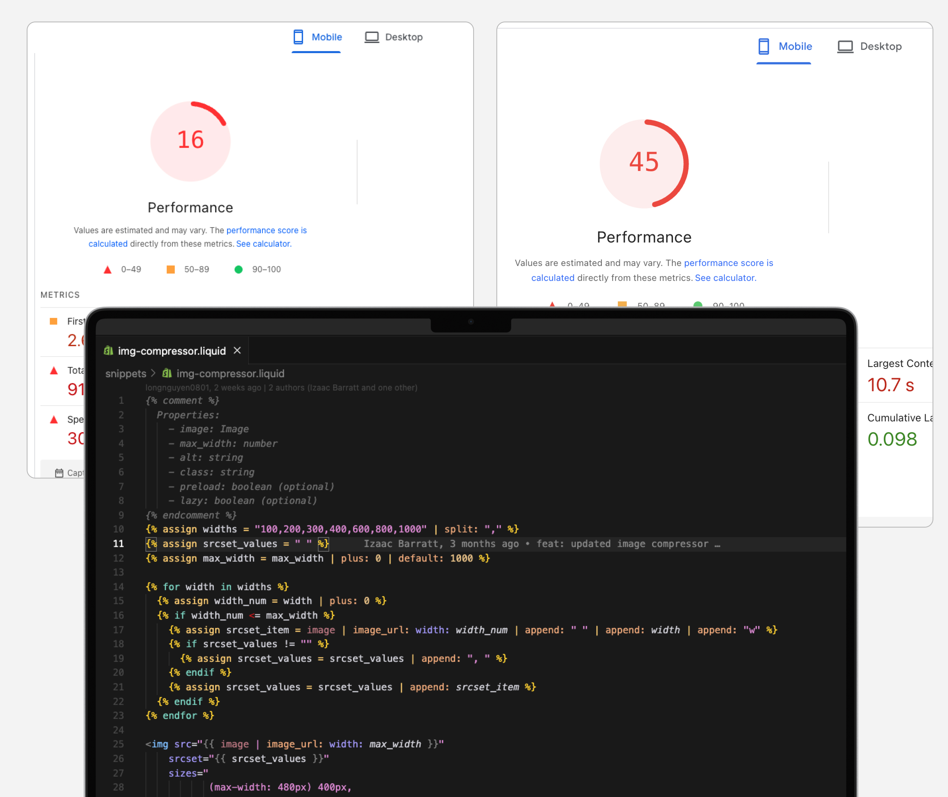
The Old Way (Deprecated)
If you're using this pattern, it's time to upgrade:
{% render 'img-compressor',
   image: product.featured_image,
   max_width: 800,
   alt: product.title %}
This worked. But required:
- Maintaining custom snippet code
- Manual srcset generation
- Breakpoint management
- Format conversions handled elsewhere
The Modern Way: Native image_tag
Shopify's image_tag filter (introduced in OS 2.0+) does everything automatically:
Basic Usage:
{{ product.featured_image | image_url: width: 800 | image_tag:
   loading: 'lazy',
   widths: '400, 600, 800, 1000',
   alt: product.title }}
What this does:
- Generates srcset automatically with specified widths
- Serves WebP to supporting browsers (with JPEG fallback)
- Lazy loads by default
- Handles retina displays (2x, 3x)
- Zero custom code maintenance
Implementation Guide
1. Hero/LCP Images (Above the Fold)
Critical: Your first visible image should load immediately.
{{ section.settings.hero_image | image_url: width: 1600 | image_tag:
   loading: 'eager',
   fetchpriority: 'high',
   widths: '800, 1200, 1600, 2000',
   sizes: '(min-width: 1200px) 1200px, 100vw',
   alt: 'Hero banner description' }}
Key attributes:
loading: 'eager'- Downloads immediately (never lazy-load LCP!)fetchpriority: 'high'- Browser prioritizes this resourcewidths- Responsive breakpointssizes- Tells browser which size to use when
2. Product Images (Below the Fold)
Standard approach for most images:
{{ product.featured_image | image_url: width: 800 | image_tag:
   loading: 'lazy',
   widths: '400, 600, 800, 1000',
   sizes: '(min-width: 768px) 50vw, 100vw',
   alt: product.title }}
Key attributes:
loading: 'lazy'- Defers download until needed- Smaller
widthsfor product grids (400-800px range) sizesadapts to your layout (50vw on desktop, 100vw on mobile)
3. Carousel Images (Images 2+)
Only first carousel image loads immediately:
{% for image in product.images %}
  {{ image | image_url: width: 800 | image_tag:
     loading: forloop.first ? 'eager' : 'lazy',
     widths: '400, 600, 800',
     alt: product.title | append: ' - view ' | append: forloop.index }}
{% endfor %}
What this does:
- First image:
loading: 'eager'(visible immediately) - Images 2+:
loading: 'lazy'(load when user swipes) - Saves bandwidth on hidden images
4. Thumbnails & Grids
Smaller sizes for grid layouts:
{{ product.featured_image | image_url: width: 400 | image_tag:
   loading: 'lazy',
   widths: '200, 300, 400',
   sizes: '(min-width: 768px) 25vw, 50vw',
   class: 'product-grid-image',
   alt: product.title }}
Why smaller widths:
- Thumbnails never display full-size
- 400px max handles retina displays
- Faster loads on product collection pages
Advanced: Preloading Critical Images
For even faster LCP, preload your hero image in <head>:
{% if template == 'index' %}
  <link rel="preload"
        as="image"
        href="{{ section.settings.hero_image | image_url: width: 1600 }}"
        imagesrcset="
          {{ section.settings.hero_image | image_url: width: 800 }} 800w,
          {{ section.settings.hero_image | image_url: width: 1200 }} 1200w,
          {{ section.settings.hero_image | image_url: width: 1600 }} 1600w"
        imagesizes="(min-width: 1200px) 1200px, 100vw">
{% endif %}
When to use:
- Homepage hero images
- Collection banner images
- Any above-the-fold image critical to LCP
Don't overuse: Only preload 1-2 images max. Too many preloads slow everything down.
Choosing the Right Width Values
Rule of thumb: Image max-width = displayed size × 1.5 (for retina)
By Use Case:
| Use Case | Display Width | Max Width | Widths Array |
|---|---|---|---|
| Product thumbnail | 200px | 400px | 200, 300, 400 |
| Product main image | 600px | 1000px | 400, 600, 800, 1000 |
| Hero banner | 1200px | 2000px | 800, 1200, 1600, 2000 |
| Blog images | 600px | 900px | 400, 600, 800 |
| Collection grid | 300px | 500px | 200, 300, 400, 500 |
Check your display size:
- Open Chrome DevTools
- Inspect the image
- Check the element's width in CSS
- Set max_width to ~150% of that
Common Mistakes to Avoid
❌ Never lazy-load LCP images
<!-- WRONG: Hero with lazy loading -->
{{ hero_image | image_tag: loading: 'lazy' }}

<!-- RIGHT: Hero loads immediately -->
{{ hero_image | image_tag: loading: 'eager', fetchpriority: 'high' }}
❌ Don't set widths too high
<!-- WRONG: Thumbnail with 2000px max -->
{{ product.image | image_url: width: 2000 | image_tag }}

<!-- RIGHT: Thumbnail with appropriate max -->
{{ product.image | image_url: width: 400 | image_tag }}
❌ Don't skip alt text
<!-- WRONG: No alt text -->
{{ product.image | image_tag }}

<!-- RIGHT: Descriptive alt -->
{{ product.image | image_tag: alt: product.title }}
❌ Don't lazy-load all carousel images
<!-- WRONG: First image lazy loaded -->
{% for image in product.images %}
  {{ image | image_tag: loading: 'lazy' }}
{% endfor %}

<!-- RIGHT: First eager, rest lazy -->
{% for image in product.images %}
  {{ image | image_tag: loading: forloop.first ? 'eager' : 'lazy' }}
{% endfor %}
Migration Checklist
If you're moving from custom img-compressor snippet:
- Find all
{% render 'img-compressor' %}instances - Replace with
image_tagfilter - Set appropriate
widthsarray for each use case - Add
sizesattribute matching your CSS breakpoints - Use
loading: 'eager'for LCP images - Use
loading: 'lazy'for below-fold images - Add
fetchpriority: 'high'to hero images - Test with Google PageSpeed Insights
- Verify in Chrome DevTools Network tab
- Delete old
img-compressor.liquidsnippet
Performance Impact
Expected improvements after migration:
LCP (Largest Contentful Paint):
- Before: 2.5-4s (custom snippet)
- After: 1.5-2.5s (native image_tag + preload)
- Improvement: ~30-40% faster LCP
Bandwidth Savings:
- Mobile users get appropriately-sized images
- WebP format ~30% smaller than JPEG
- Lazy loading reduces initial page weight by 40-60%
Core Web Vitals:
- ✅ LCP: < 2.5s (from faster loading)
- ✅ CLS: 0 (proper sizing prevents layout shift)
- ✅ FID/INP: Improved (less parsing overhead)
Verification Steps
1. Check Image Formats
Open Chrome DevTools → Network tab → Filter by Images
Look for:
- ✅ WebP format served (not just JPEG/PNG)
- ✅ Multiple sizes in srcset
- ✅ Correct size downloaded for viewport
2. Test Lazy Loading
Scroll slowly down the page with Network tab open.
Verify:
- ✅ Above-fold images load immediately
- ✅ Below-fold images load as you scroll
- ✅ No images loading unnecessarily
3. Google PageSpeed Insights
Run before/after comparison.
Check:
- ✅ LCP score improved
- ✅ "Properly sized images" passing
- ✅ "Defer offscreen images" passing
- ✅ "Serve images in modern formats" passing
Advanced: Speculation Rules for Prerendering
Bonus optimization for instant page loads:
If users frequently navigate from homepage → product pages, prerender the likely next page:
<script type="speculationrules">
{
  "prerender": [{
    "where": {
      "selector_matches": ".product-card a"
    },
    "eagerness": "moderate"
  }]
}
</script>
What this does:
- Browser prerenders product pages when hovering product cards
- Next page loads instantly (already rendered)
- Feels like instant navigation
Caveat: Use sparingly. Prerendering consumes bandwidth and resources.
Results You Can Expect
Based on optimization projects:
Before Native image_tag:
- Custom snippet maintenance required
- Manual format handling
- Average LCP: 2.5-4s
- Occasional srcset mismatches
After Native image_tag:
- Zero custom code maintenance
- Automatic WebP conversion
- Average LCP: 1.5-2.5s
- Consistent responsive behavior
- ~20% faster page loads
When to Use What
Use loading: 'eager' + fetchpriority: 'high':
- Hero images
- First carousel image
- Any LCP candidate (largest above-fold image)
Use loading: 'lazy':
- Product images below the fold
- Carousel images 2+
- Thumbnails in grids
- Blog post images
- Footer content
Use preload in <head>:
- Homepage hero (1 image only)
- Collection banner (1 image only)
- Never more than 2 preloads total
Troubleshooting
"Images still slow on mobile"
Check:
- Are widths appropriate? (Not serving 2000px to mobile)
- Is LCP image lazy-loaded? (Should be eager)
- Is hero preloaded in head?
- Are you testing on throttled 3G?
"WebP not serving"
Shopify automatically handles this. If WebP not showing:
- Check browser supports WebP (all modern browsers do)
- Verify using native
image_tag(notimgHTML tag) - Check Network tab for format
"Layout shift (CLS) issues"
Cause: Missing width/height attributes
Fix:
{{ image | image_url: width: 800 | image_tag:
   width: image.width,
   height: image.height }}
Further Optimization
Once native image_tag is implemented:
-
Compress source images before uploading to Shopify
- Target: < 200kb per image
- Use TinyPNG or similar before upload
-
Use CDN (Shopify's built-in)
- Already enabled by default
- No action needed
-
Monitor with RUM
- Use Google Analytics + Web Vitals
- Track real user LCP over time
-
Test on real devices
- iPhone on cellular
- Android on slow 3G
- Worst-case scenario testing
Summary
Old way (2022):
- Custom
img-compressorsnippet - Manual srcset generation
- Maintenance overhead
New way (2026):
- Native Shopify
image_tag - Automatic responsive sizing
- WebP conversion built-in
- Zero maintenance
Bottom line: Delete your custom snippet. Use native image_tag. Get better results with less code.
Quick Reference
Hero Image (LCP):
{{ hero | image_url: width: 1600 | image_tag:
   loading: 'eager',
   fetchpriority: 'high',
   widths: '800, 1200, 1600',
   alt: 'Description' }}
Product Image (Below Fold):
{{ product.image | image_url: width: 800 | image_tag:
   loading: 'lazy',
   widths: '400, 600, 800',
   alt: product.title }}
Carousel (First Eager, Rest Lazy):
{% for image in images %}
  {{ image | image_url: width: 800 | image_tag:
     loading: forloop.first ? 'eager' : 'lazy',
     widths: '400, 600, 800',
     alt: alt_text }}
{% endfor %}
Thumbnail Grid:
{{ image | image_url: width: 400 | image_tag:
   loading: 'lazy',
   widths: '200, 300, 400',
   sizes: '(min-width: 768px) 25vw, 50vw',
   alt: title }}
Last updated: March 2026 Shopify OS compatibility: 2.0+ Browser support: All modern browsers (95%+ coverage)