Video Banners that load INSTANTLY on Shopify
⚠️ Updated 27 May 2025 — The implementation code in this post has been updated. We found a better approach on the Shopify Speed blog that solves the responsive poster problem the original missed. Content and principles are unchanged; only the code is updated.
How to Load HD Video Without Killing Your Page Speed
If large images can impact a page load, think about video. It's 30 images per second.
Sometimes your product needs to be seen in action, and images won't cut it. For those circumstances, you need video above the fold, and maybe multiple videos per page.
Don't worry — we're going to show you how to load HD video without impacting website performance.
This tutorial is specific for Shopify, but the principles apply to any web technology.
What Actually Happens (The Problem)
Most ecom sites treat videos the same way they treat images. Load everything upfront. All at once. Every video on the page, whether someone scrolls to it or not, starts downloading immediately.
Think about the math for a second. A 30-second product video at HD quality? That's roughly 30 frames per second times 30 seconds. You're asking the browser to process 900 images worth of data before someone even scrolls down the page.
Now multiply that by 5–7 videos on a typical product landing page.
Yeah. That's the problem.
Enter: The Video Facade + Lazy Loading Combo
We borrowed a concept from SaaS projects.
Instead of loading the actual video file, you load a still image first. This image is the first frame of your video, essentially a poster. It appears instantly, takes up minimal bandwidth, and holds the space while the actual video streams in the background.
This is called a facade. It's fake video. It loads in half the time, and takes the same space as the video.
Then, once the facade is on screen — we download the actual video. If your page has multiple videos, the user won't see all of them at once. We shouldn't download them all at the same time.
The average landing page scroll rate is 43%. Meaning most users will never even find the last videos.
Buckle up - it's about to get technical.
How It Works (The Technical Side)
We will make a script (load_scheduler.js) which does three things:
- Identifies videos on page load — It scans the DOM for any video element with a
data-srcattribute instead ofsrc. These are your "inactive" videos, waiting in the wings. - Waits for them to appear — Using the Intersection Observer API, the script watches these videos. The moment one enters the viewport (becomes visible), it triggers.
- Switches them on — When a video comes into view, the script swaps
data-srctosrc. Now the browser says "oh, there's a real video here" and starts loading it.
The poster image (pulled from Shopify's API) was already sitting there as a placeholder. Now the video streams in behind it.
Implementation: Step by Step
⚠️ Before touching anything: Duplicate your live theme and make all changes on the draft first. In Shopify Admin, go to Themes → ••• next to your live theme → Duplicate. This gives you a safe sandbox to work in and break things without affecting customers. It also lets you A/B test performance before and after — run both your live theme and the draft through fastersite.com/report and compare the scores side by side.
Step 1: Find Your Video Element and Replace It
First, locate the existing video element in your theme. The easiest way:
- Right-click the video on your storefront and select "Inspect" (or press F12 and click the element picker).
- In the Elements panel, look at the highlighted code. Note the class name, ID, or attributes on the
<video>tag — something likeclass="hero__video"ordata-video-src. This tells you exactly which file and section to edit in your theme. - In Shopify Admin, go to Themes → Edit code and search for that class, ID, or attribute to find the right file.
Once you've found it, replace your existing <video> element with the following. This wraps it in a <picture> element that handles responsive poster images per device — the video sits on top and covers it once it plays.
Where to add it: the section Liquid file where your video currently lives (e.g. sections/hero.liquid or sections/video-banner.liquid)
{%- liquid
  assign desktop_poster = section.settings.desktop_video.preview_image
  assign mobile_poster = section.settings.mobile_video.preview_image
  assign fetch_priority = 'auto'
  if section.index <= 2
    assign fetch_priority = 'high'
  endif
-%}

<div class="video-wrapper">

  {%- comment -%}
    Picture element = responsive poster.
    Shopify auto-generates preview_image from the video first frame.
  {%- endcomment -%}
  <picture class="video-poster">
    {%- if mobile_poster != blank -%}
      <source
        srcset="{{ mobile_poster | image_url: width: 352 }} 352w,
                {{ mobile_poster | image_url: width: 832 }} 832w"
        media="(max-width: 749px)" sizes="100vw">
    {%- endif -%}
    {%- if desktop_poster != blank -%}
      <source
        srcset="{{ desktop_poster | image_url: width: 1200 }} 1200w,
                {{ desktop_poster | image_url: width: 1920 }} 1920w"
        media="(min-width: 750px)" sizes="100vw">
      {{ desktop_poster | image_url: width: 1920 | image_tag:
         srcset: nil, class: "video-poster-img",
         fetchpriority: fetch_priority }}
    {%- endif -%}
  </picture>

  {%- comment -%}
    Video sits on top (z-index: 2). No poster attribute needed.
  {%- endcomment -%}
  <video muted autoplay loop playsinline preload="metadata"
         class="responsive-video">
    {%- if section.settings.mobile_video != blank -%}
      {%- for source in section.settings.mobile_video.sources -%}
        <source src="{{ source.url }}" type="{{ source.mime_type }}"
                media="(max-width: 749px)">
      {%- endfor -%}
    {%- endif -%}
    {%- if section.settings.desktop_video != blank -%}
      {%- for source in section.settings.desktop_video.sources -%}
        <source src="{{ source.url }}" type="{{ source.mime_type }}"
                media="(min-width: 750px)">
      {%- endfor -%}
    {%- endif -%}
  </video>

</div>
Not on Shopify? Replace the Liquid tags with static image URLs in your <source srcset> attributes, and point the <source src> tags at your video files directly.
Step 2: Add the CSS
This is what makes the layering work. The picture sits behind at z-index 1, the video on top at z-index 2.
Where to add it:
- If this is the only section using a video: paste it inside the same section Liquid file, in a
<style>tag at the top. - If you have videos across multiple sections: add it to
theme.liquid(Admin → Themes → Edit code →theme.liquid) inside a<style>tag before the closing</head>tag, so it loads globally.
.video-wrapper {
  position: relative;
  width: 100%;
  height: 100%;
}

.video-wrapper .video-poster {
  position: absolute;
  inset: 0;
  z-index: 1;
  pointer-events: none;
}

.video-wrapper .video-poster img {
  width: 100%;
  height: 100%;
  object-fit: cover;
  object-position: center center;
}

.video-wrapper .responsive-video {
  position: relative;
  width: 100%;
  height: 100%;
  object-fit: cover;
  object-position: center center;
  z-index: 2;
}
Step 3: Test in DevTools
Open your browser's Network tab. Reload the page. You should see:
- Poster images load immediately, correctly sized for the device
- Video files do NOT load until you scroll to them
- Once in view, videos start downloading and play seamlessly
That's it. That's the win.
Testing & Validation
Network Inspection
Before and after comparison is your best friend here. Use Chrome DevTools:
- Open Network tab
- Filter by "media" to see video requests
- Reload your page and note total video requests
- Scroll through the page normally
- See when videos actually load (should be right when they enter viewport)
You should notice fewer initial requests and more staggered loading as users scroll.
Performance Metrics
Check your Lighthouse scores (Devtools → Lighthouse). Run reports before and after implementation. Watch for improvements in:
- Largest Contentful Paint (LCP)
- Cumulative Layout Shift (CLS)
Real User Monitoring
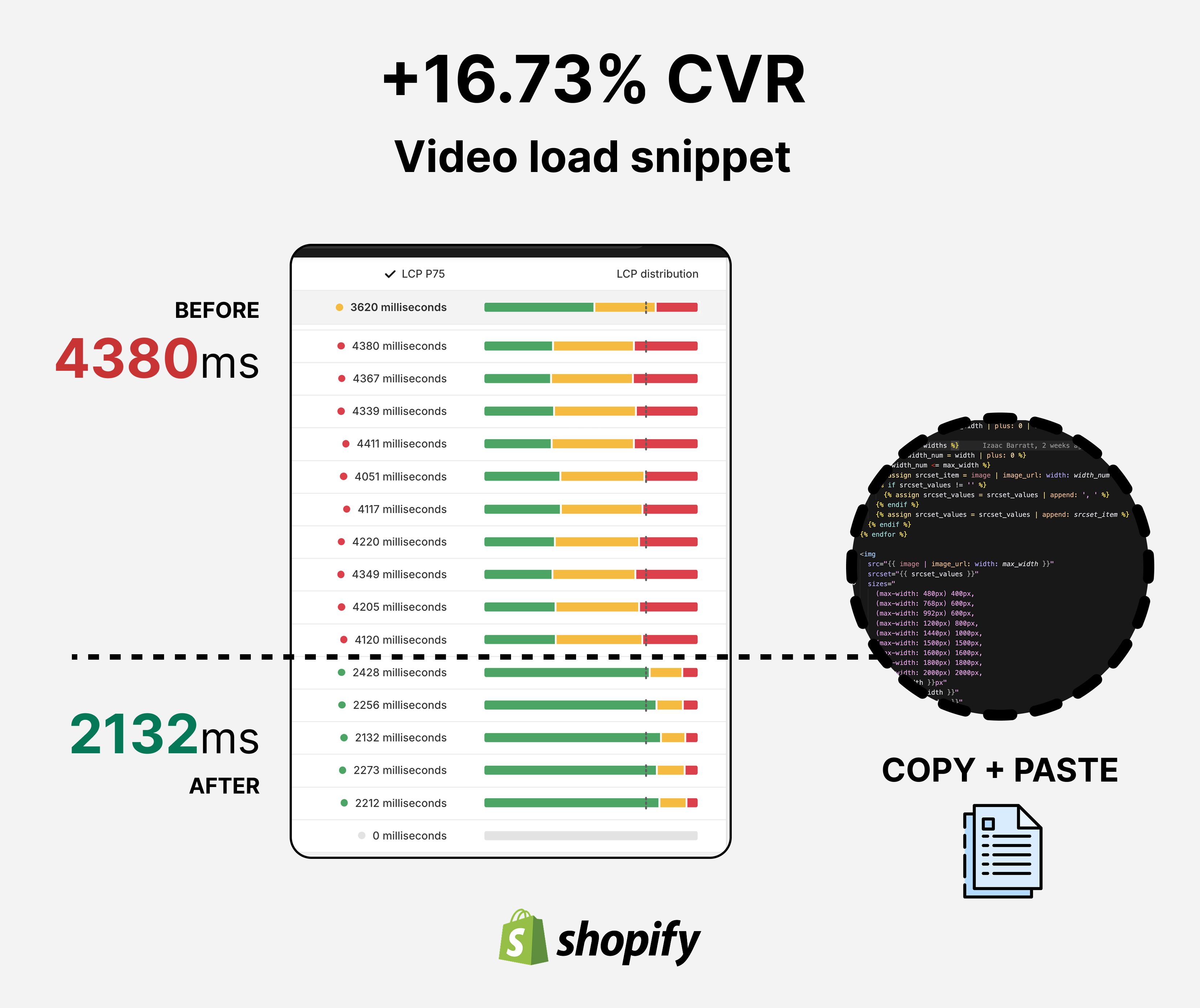
Most importantly, track your actual metrics. Page load time, bounce rate, time on page, conversion rate. The script should show measurable impact within a week or two.
With our clients, we typically see 15–40% improvement in initial load time on video-heavy pages, depending on how many videos are below the fold.
Conclusion
You're not removing the premium video experience. You're delivering it smarter.
Users still get their HD product videos. The page still feels rich and engaging. But now it loads in a fraction of the time because you're not forcing their browser to download every video before they've even scrolled.
It's the performance equivalent of not printing the entire menu when someone walks into a restaurant. You give them the appetizer section first.
The result? Faster perceived load times, less bandwidth waste, and typically a noticeable bump in how far users scroll and how long they stay. That compounds into better conversion metrics downstream.
If you implement this, let me know how it goes. This approach works across most ecom platforms — Shopify, WooCommerce, custom builds. The principle is the same: load what's visible, defer what's not.