
Correctly size Images
Stop shipping desktop-sized pixels to mobile screens.
What is a correctly sized image?
Not downloading images bigger than your screen size.
For example, desktop images are bigger than mobile.
You don't want to download a big image on a small screen. It results in wasted pixels and slower load times for no visual difference.
Not to be confused with compression:
- Compression = complexity of image
- Image size = size of the image
But these two methods can be combined to make images MUCH smaller and faster to display.
How to implement
Setup
- This is a code based implementation using Shopify image_tag sizes. For documentation CLICK HERE
- This should not be used on the LCP image (as covered in Preload Images tab), this is for other images below the fold
Method
Requires code access. Use Online Store > Edit Theme Code, or download the theme and edit locally.
-
Find the images you want to correctly size.
Ideally - your theme has some sort of image.snippet that is reused across the site (this means we only have to apply the fix once). Be careful not to apply this to your LCP image though. CLICK HERE for a quick guide on finding assets in the code -
In the code editor, create a new variable called sizes in this format:
Use these values for the corresponding image size (relative to the screen):
| Mobile Width | Desktop Width | Sizes Code |
|---|---|---|
| 1/2 | 1/4 | (min-width: 990px) 25vw, 50vw |
| Full | 1/2 | (min-width: 990px) 50vw, 100vw |
| Full | Full | 100vw |
The code should look like this:
assign sizes = '(min-width: 990px) 25vw, 50vw'
-
Add the sizes variable to your Shopify image_tag.
It should now look like this:
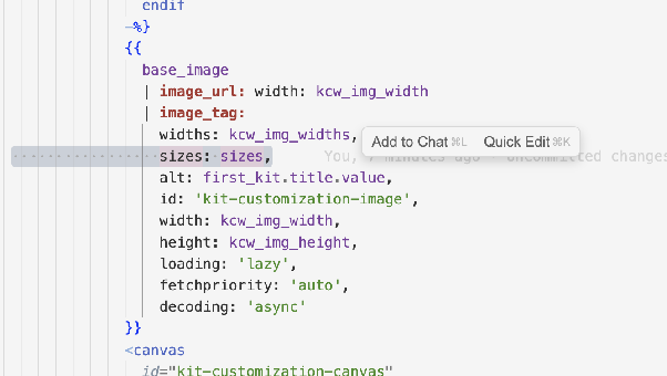
-
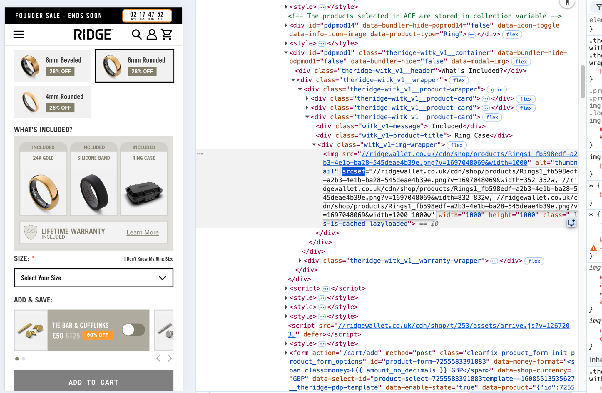
Refresh your draft theme, and check if the results have been applied. Use Right Click > Inspect to see if your image has a srcset value:
—--
Caveats:
-
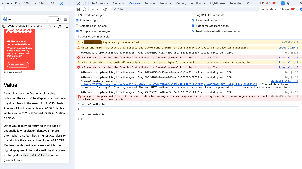
Modern screens normally request images 3x larger than needed. They base this on their pixel density - HD screens can display better resolution.
You can check this on the browser by going to Right Click > Inspect > Console, and inputting this: devicePixelRatio. On my macbook I get a 3. Don't be alarmed if the images pulled are bigger.
-
Testing
LCP should be faster.
Unlock everything!
This will be slowly releasing in the build up to BFCM 26. To get the rest of the training in advance, sign up to the newsletter. New training live every week